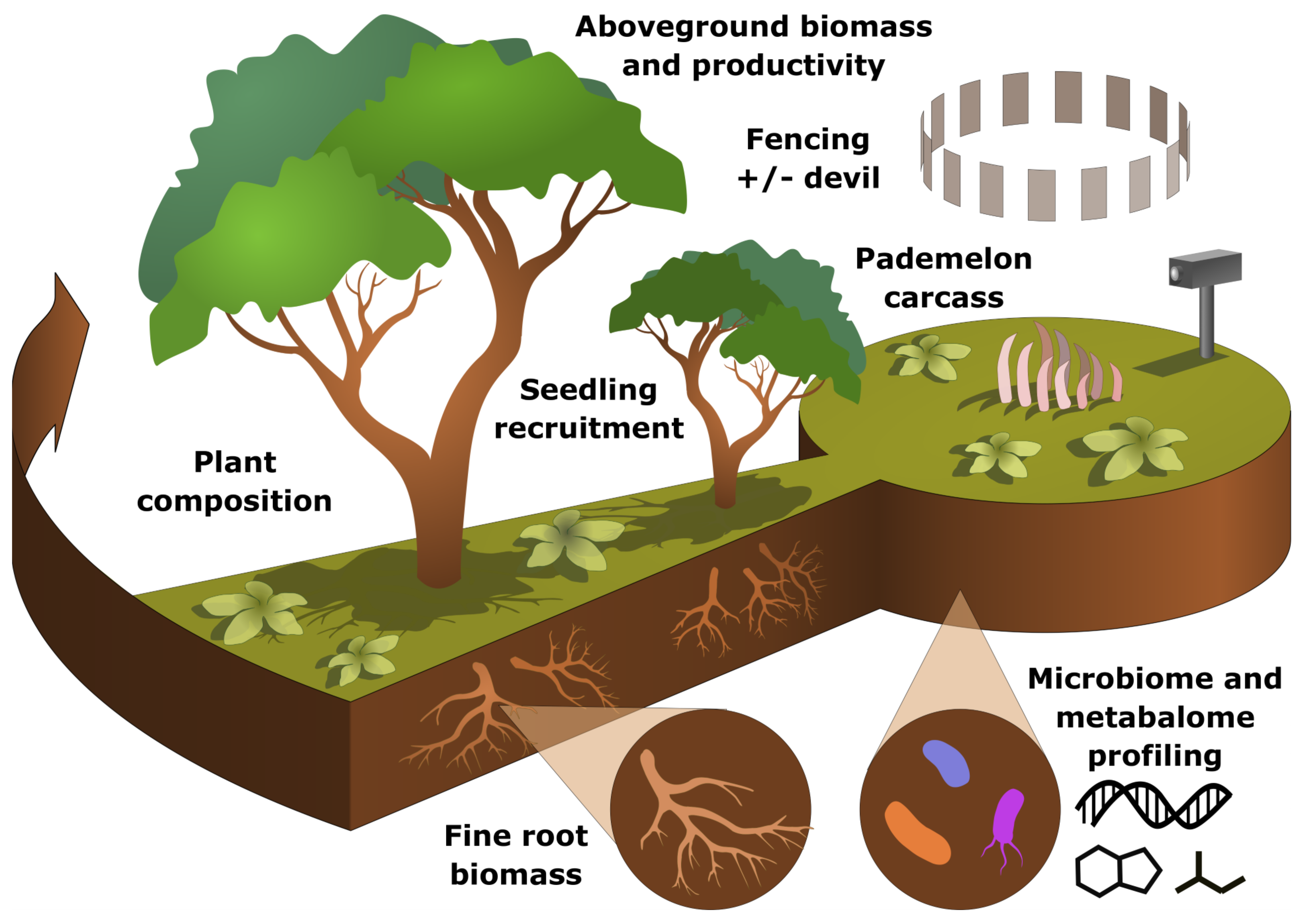
Conceptual diagram of an experiment involving plant and soil community characterization.
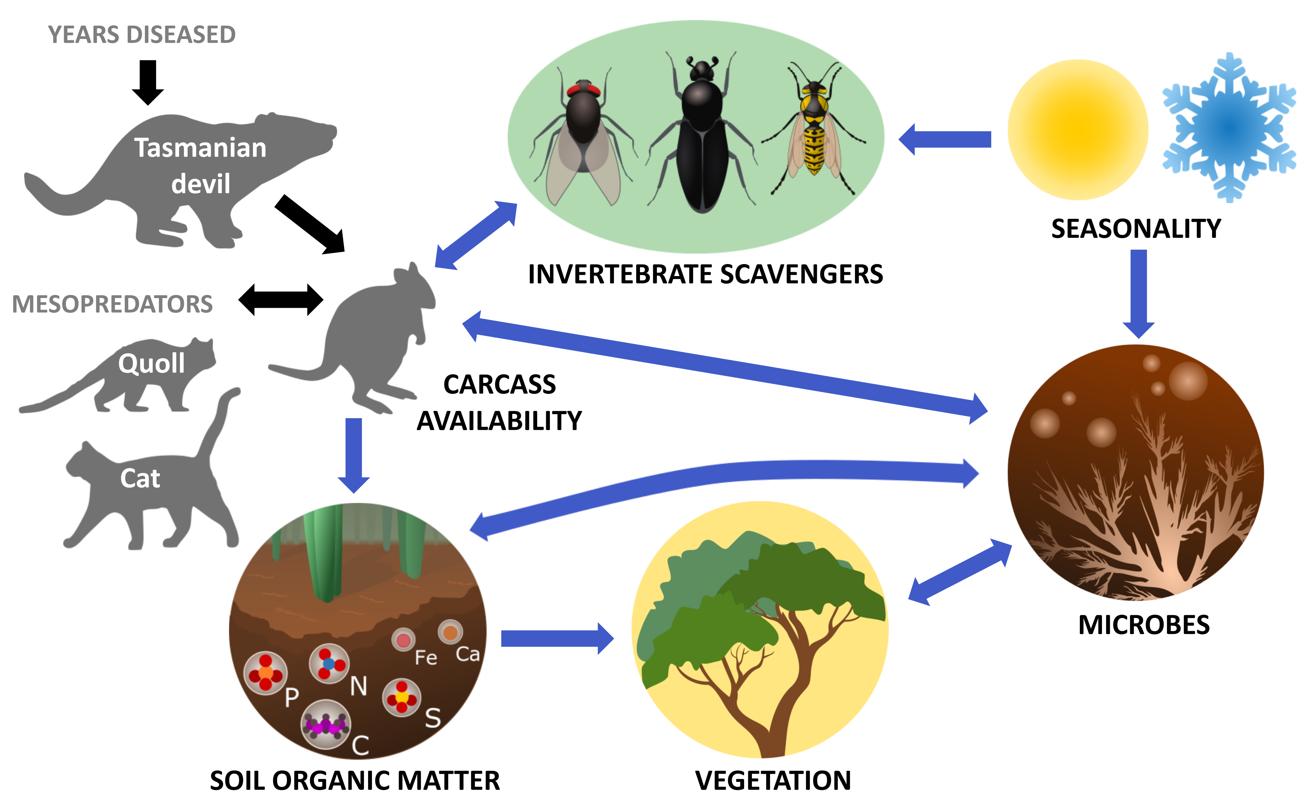
Conceptual diagram of ecosystem feedbacks.
Data visualization is a crucial component of science communication, particularly at the data / decision-making interface where individuals of varying backgrounds coalesce. I have over ten years of experience using graphic design software to generate high-quality illustrations, which have been featured in peer-reviewed publications, numerous presentations given by myself and colleagues, and grant proposals. Of the five grant proposals that I have contributed illustrations and conceptual diagrams to, two have been funded by the National Science Foundation. Below is a sample of my graphic design work.
|
|
|
|
Conceptual diagram of an experiment involving plant and soil community characterization. |
Conceptual diagram of ecosystem feedbacks. |